Chiro Connect is a Wanaka-based chiropractic clinic providing preventative, holistic healthcare. Having already been successfully established within the marketplace for six years, owner Kate approached White Light to help align her brand identity with a shift in focus after taking some time away from the business to start a family of her own.
The new identity sets Chiro Connect apart from the competition and speaks powerfully to the clinic’s natural and holistic approach to healthcare. The bold, sans-serif typeface is indicative of the confidence the business has in the benefits of chiropractic care whilst the use of lowercase letters give the brand an approachable, family-friendly aesthetic. The muted colour palette is warm, natural and calm. It adds a sense of energy and vitality to the brand, commanding attention without being overpowering.
The logomark is made up of 3 symbols – the letter C, a leaf and a circle. The two letter C’s (representative of the words ‘Chiro’ and ‘Connect’) are linked together to visually communicate the idea of connection and the duality between the mind and the body that lies at the centre of the chiropractic approach. The leaf is representative of nature and symbolic of upward growth, alluding to the clinic’s natural approach to health and wellbeing. These elements are encased within a circle representative of wholeness and suggestive of unity, harmony and connection. In its completeness, the circular logomark confines what’s within and keeps things out, alluding to the non-invasive approach of chiropractic care. The two C’s join at the top and bottom of the leaf’s spine which alludes to the nervous system and creates a holistic, balanced mark that can be applied with versatility.
What we did
Concepts and idea generation
Brand identity and guidelines
Illustration
Print collateral (inc. business and appointment cards)
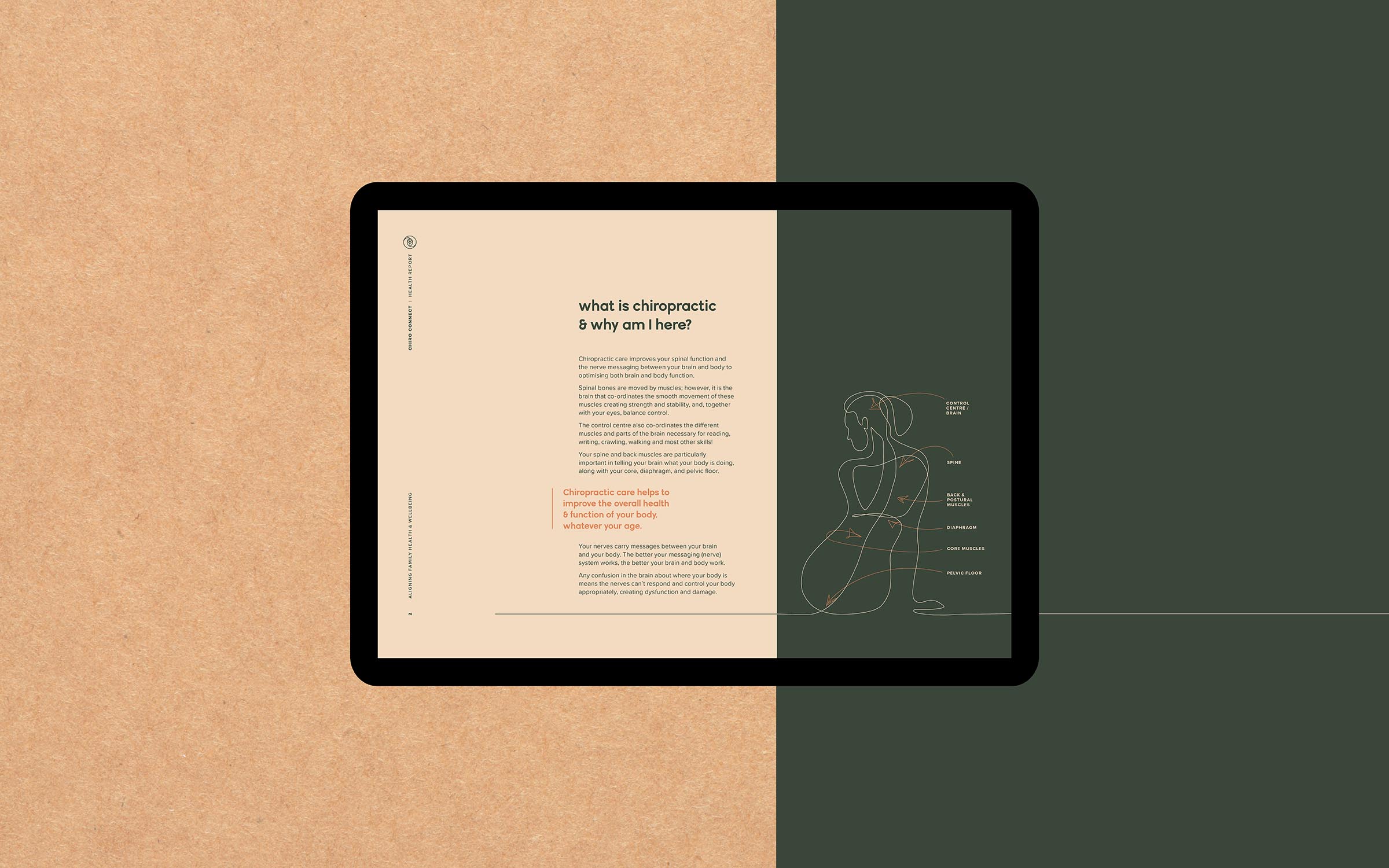
Digital health report document
Print management