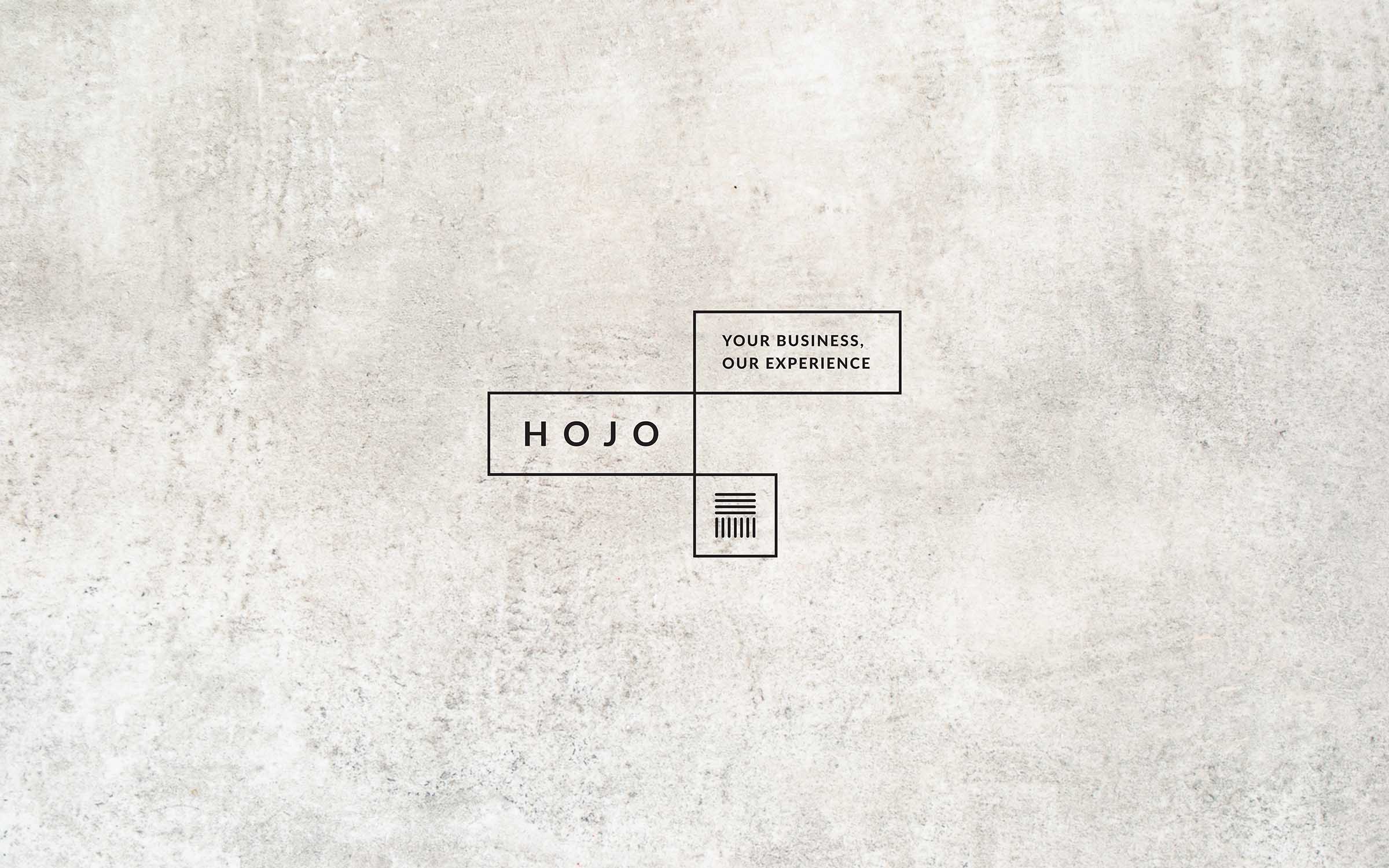
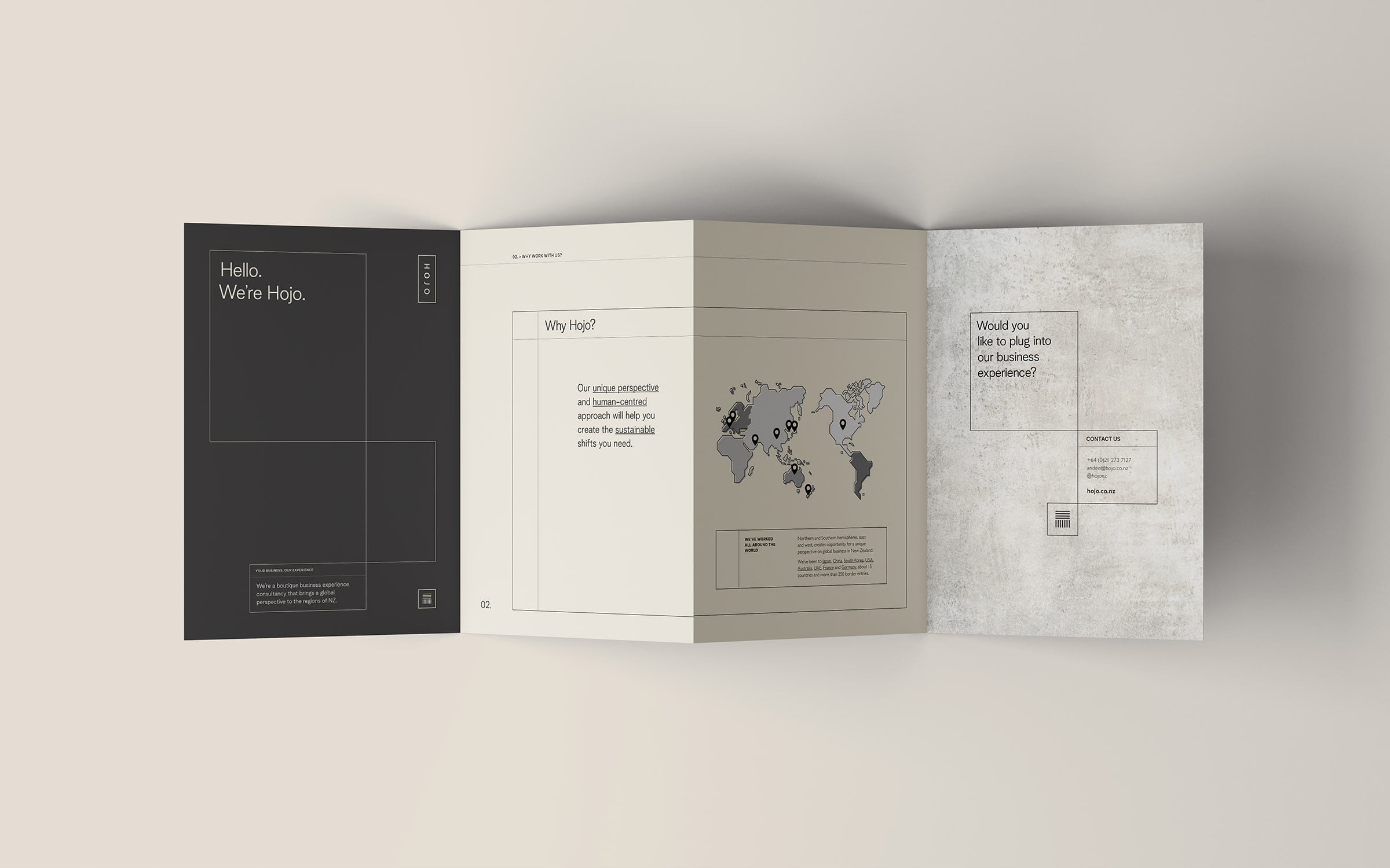
Hojo is a business experience consultancy based in New Zealand’s South Island With more than 20 years’ experience working alongside Japanese colleagues, Director Andee was always impressed by the Japanese culture’s dedication to constant improvement; a multifaceted evolution that incorporated bringing order, structure and balance to every aspect of life. The brand’s identity system captures this Japanese aesthetic of structure and balance in a clean, sophisticated and contemporary way that works for the Westernised market and sets the business apart from its competitors.
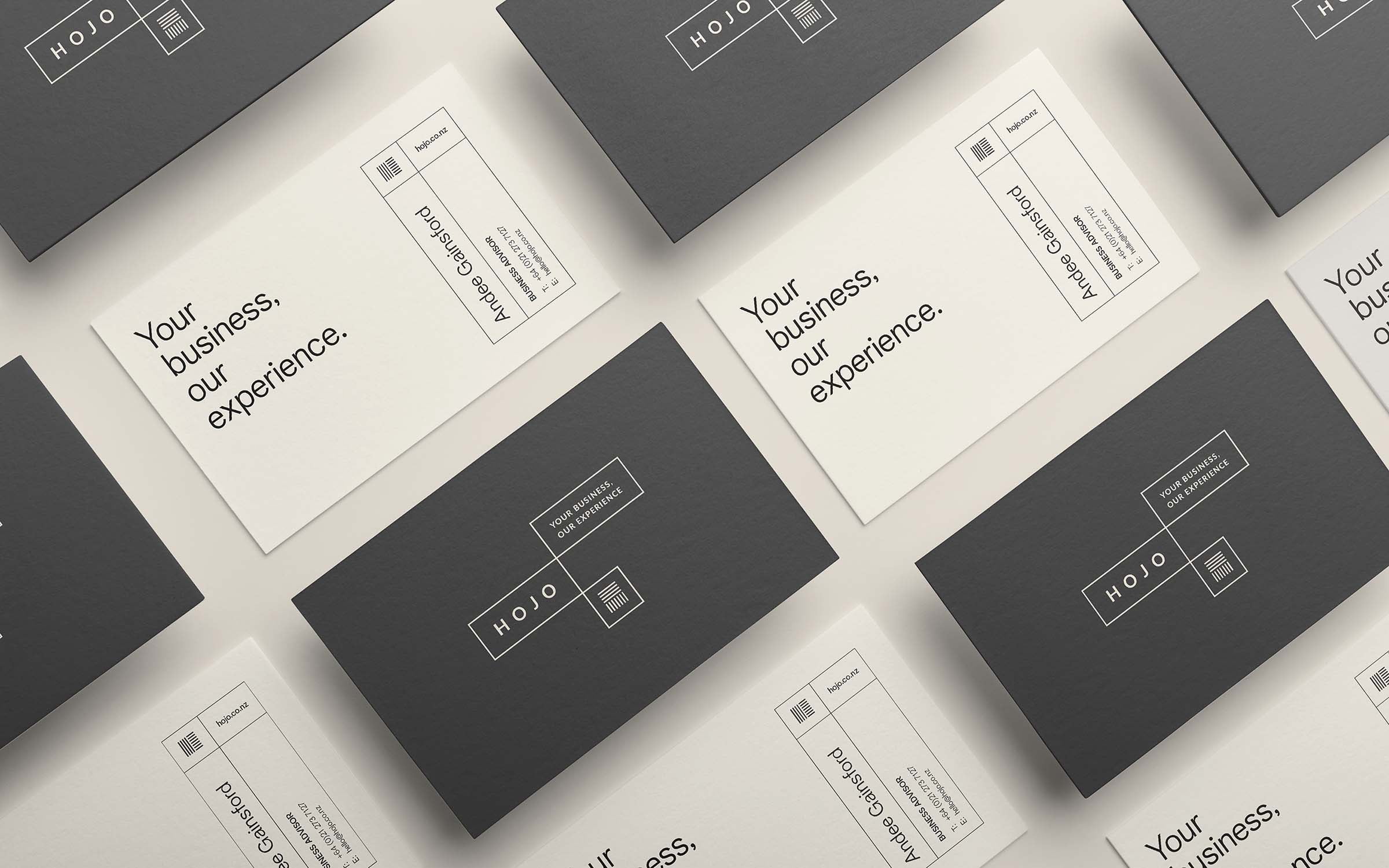
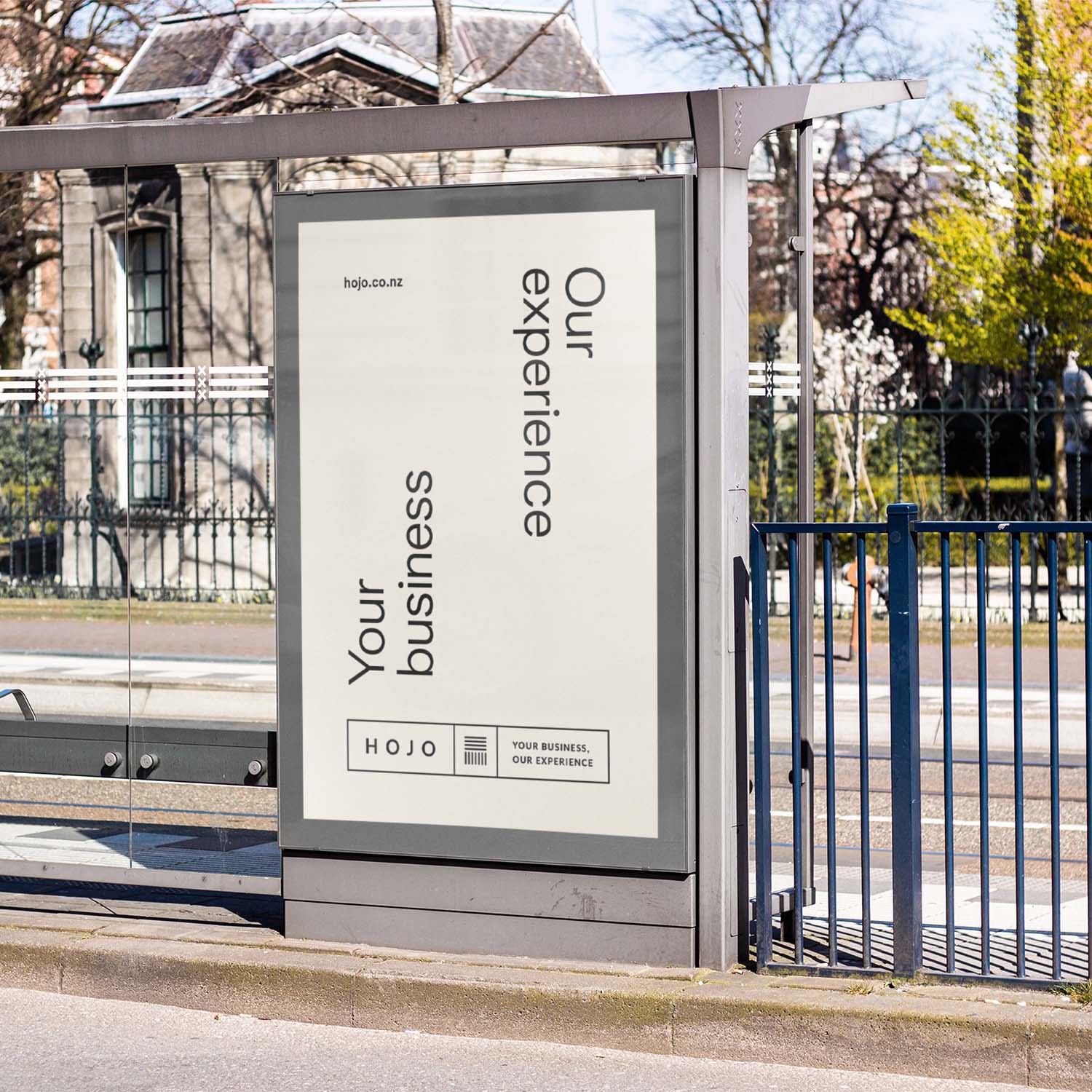
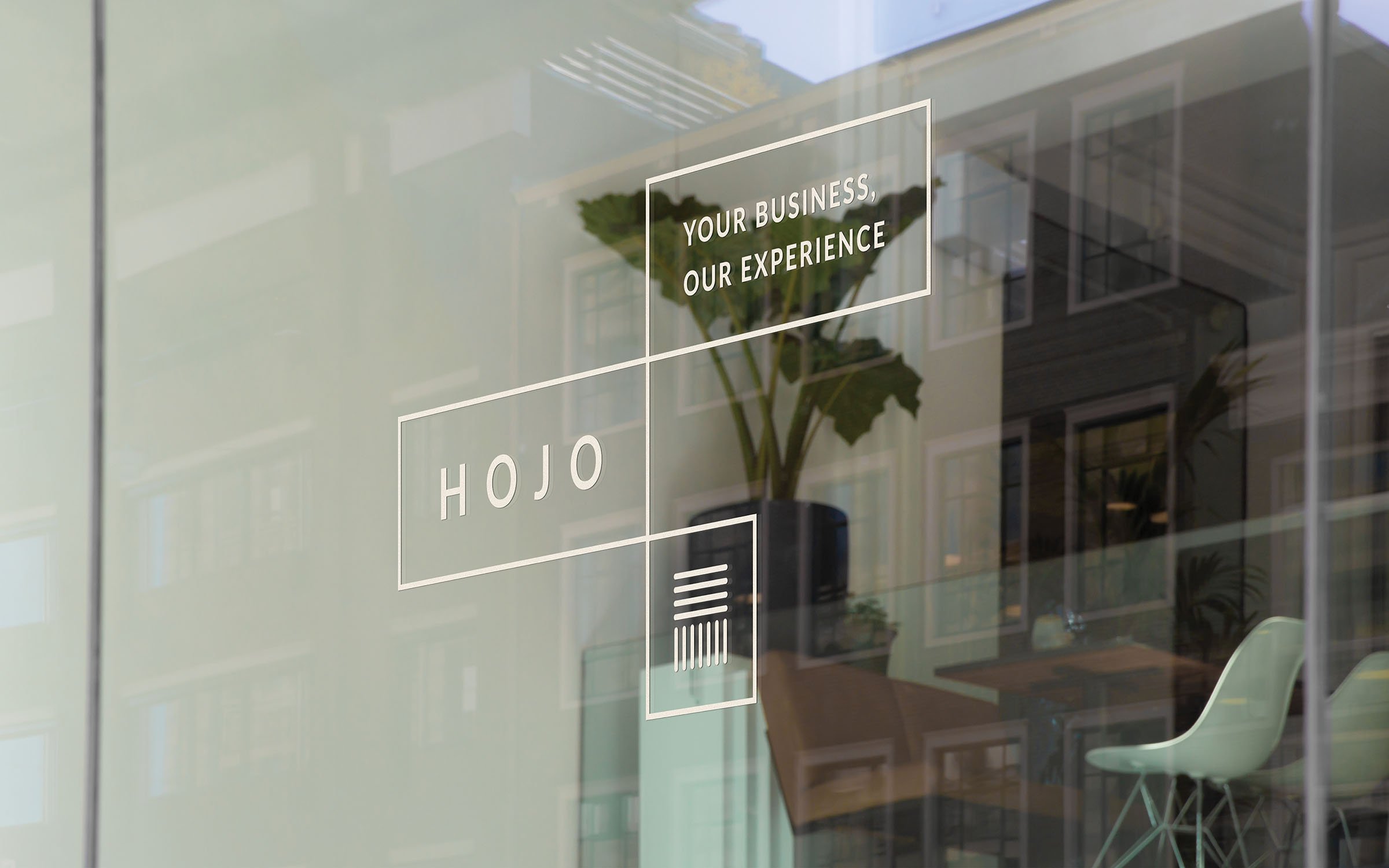
The logo lockup is made up of three blocks that stack and slot together in a dynamic, grid-like formation. These blocks are designed to move around individually, always connected to reflect the adaptability of Hojo’s business approach. This dynamic, interchangeable brandmark references the Japanese Bentobox – a structure that displays a balanced array of food groups clearly to its recipient; in the same way Hojo organises chaos within a business to allow people to clearly review what’s in front of them in order to decide on how to move forward.
What we did
Concepts and idea generation
Brand identity and guidelines
Print collateral (inc. business cards)
Digital collateral
Responsive website design
Responsive website development