The Reformery is a newly established Pilates studio based in the heart of Wanaka. With a focus on making clients feel better in their bodies by improving balance, strength, flexibility and awareness of inner-body connectivity, the studio’s aim is to get every ‘body’ moving at its optimum. Owner and teacher Bree celebrates the fact that everyone is different and creates bespoke classes for her clients based on their specific needs – something she requested we highlight in the creation of her new brand identity.
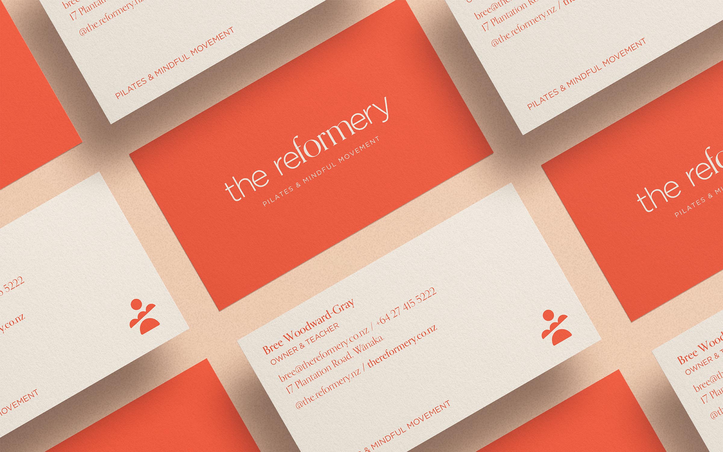
The final result is a wordmark crafted from a combination of two different fonts to illustrate the idea that every ‘body’ is unique in its physical expression. It also serves to highlight the word ‘form’ in the business name which emphasises the importance the studio’s teachers place on moving correctly during the practice of pilates.
The logomark is made up of three simple shapes which, stacked together, create a balanced mark that allude to the silhouette of a person. The circle (the head) is representative of wholeness and suggestive of unity and connection, alluding to the idea of the body working in harmony through the practice of Pilates. The unique shape in the middle (the body/arms) is representative of every ‘bodies’ unique journey through life by visually alluding to the ups and downs that we all experience. The semi-circle (the legs) is representative of the solid foundation that a regular Pilates practice provides for your mind and body.
What we did
Naming
Concepts and idea generation
Brand identity and guidelines
Print collateral (inc. business cards)
Signage
Responsive website holding page design
Responsive website holding page development
Print management