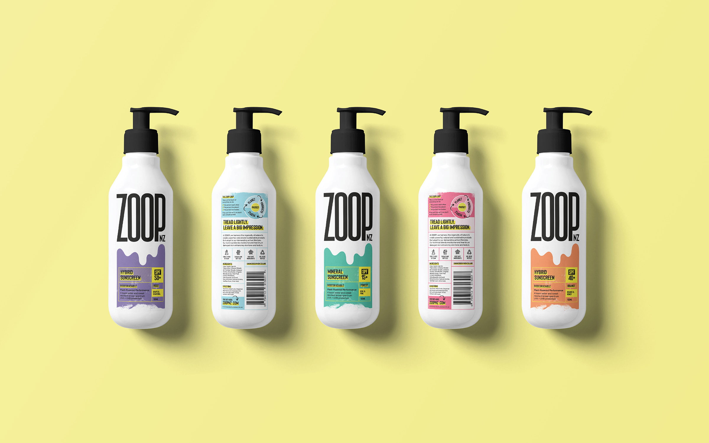
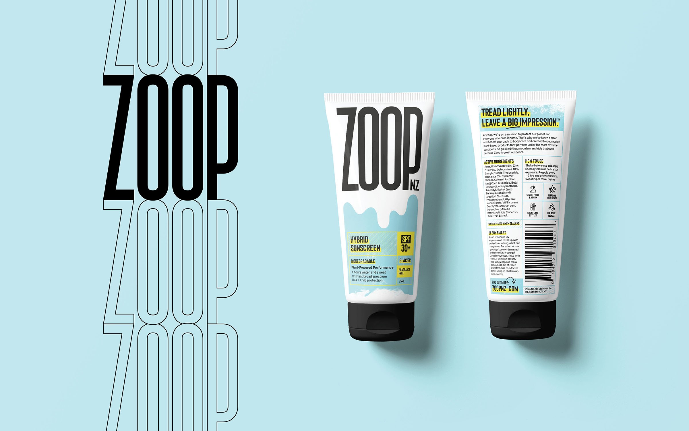
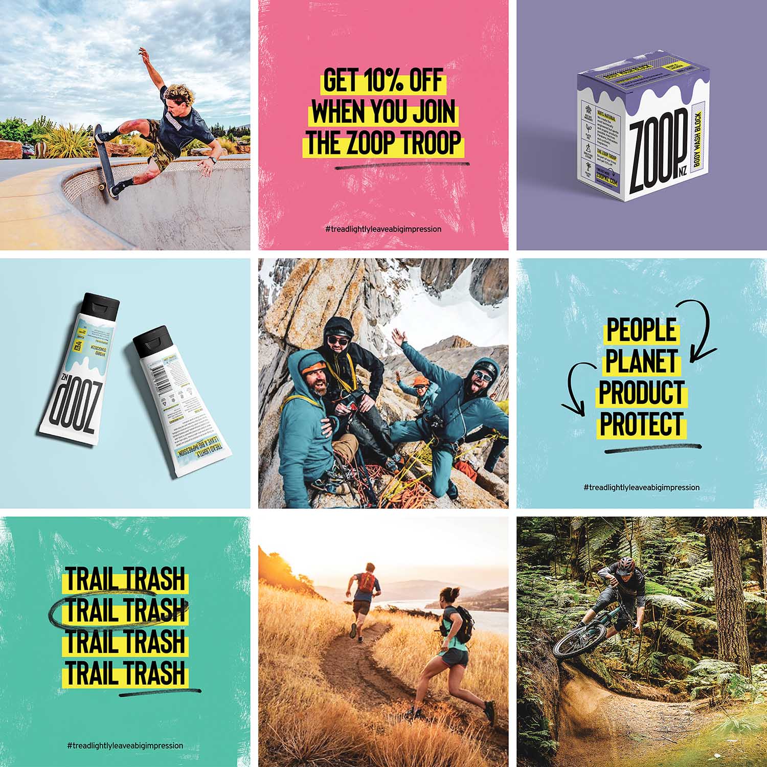
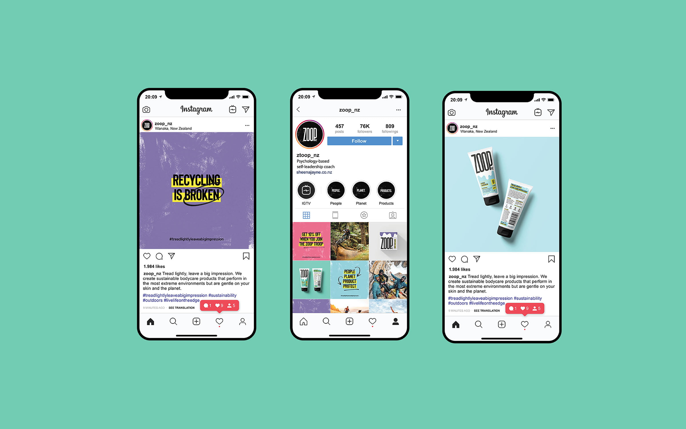
Zoop is a sustainable bodycare brand with products built to perform under the most extreme environments. Through bold, interesting photography; straight-talking, sit-up and listen copy; and playful colours we built a brand that’s led by its attitude and backed by its products.
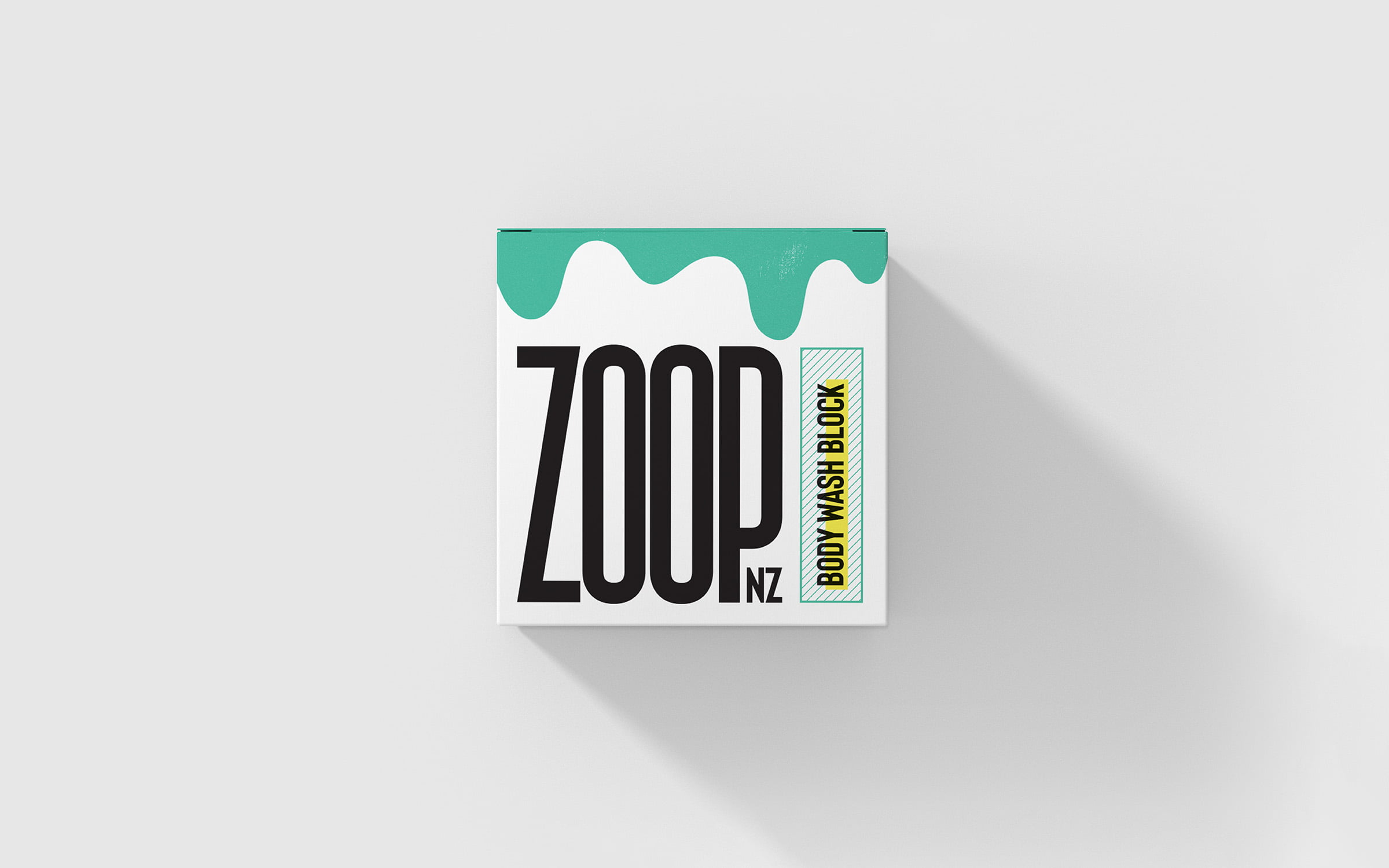
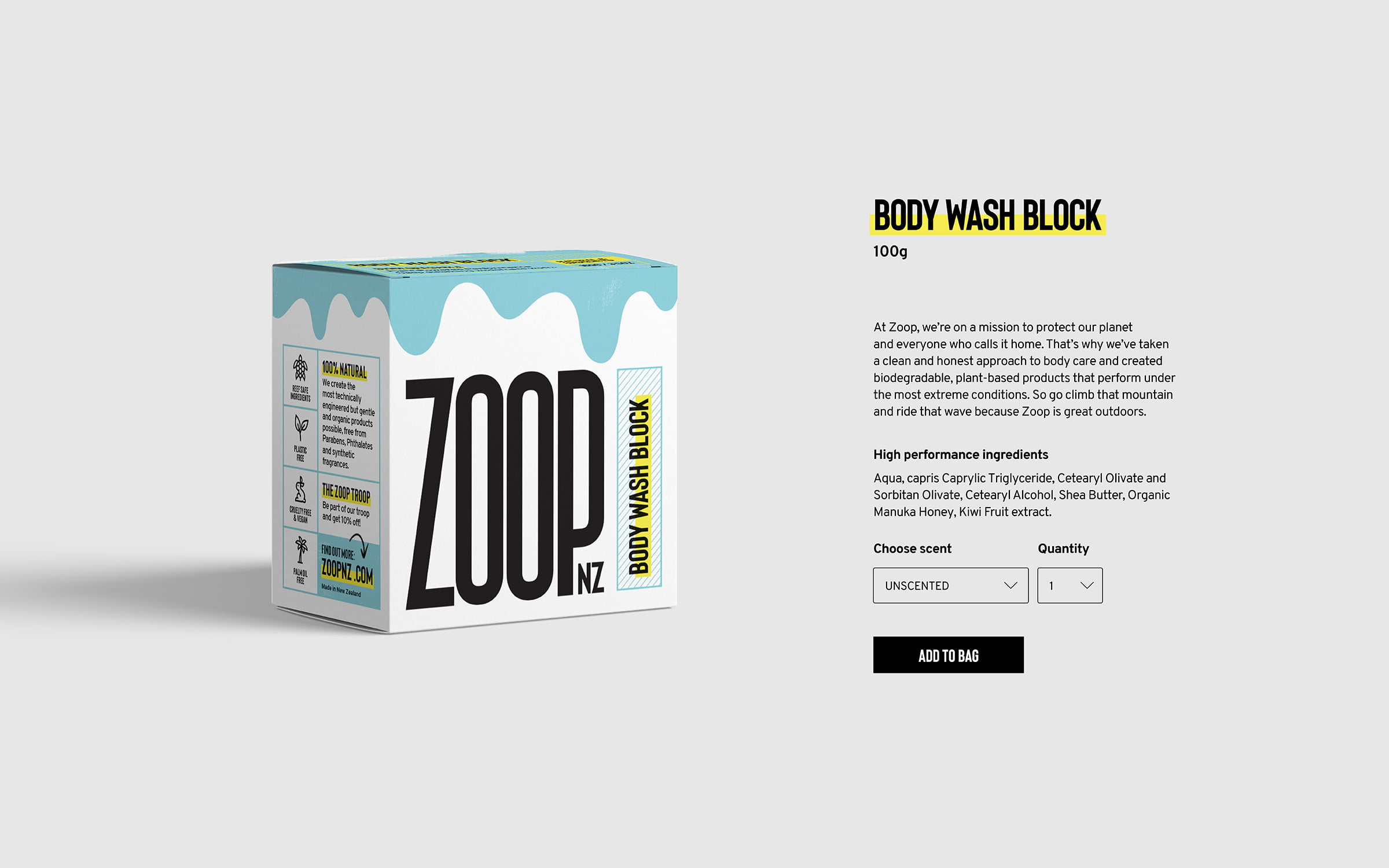
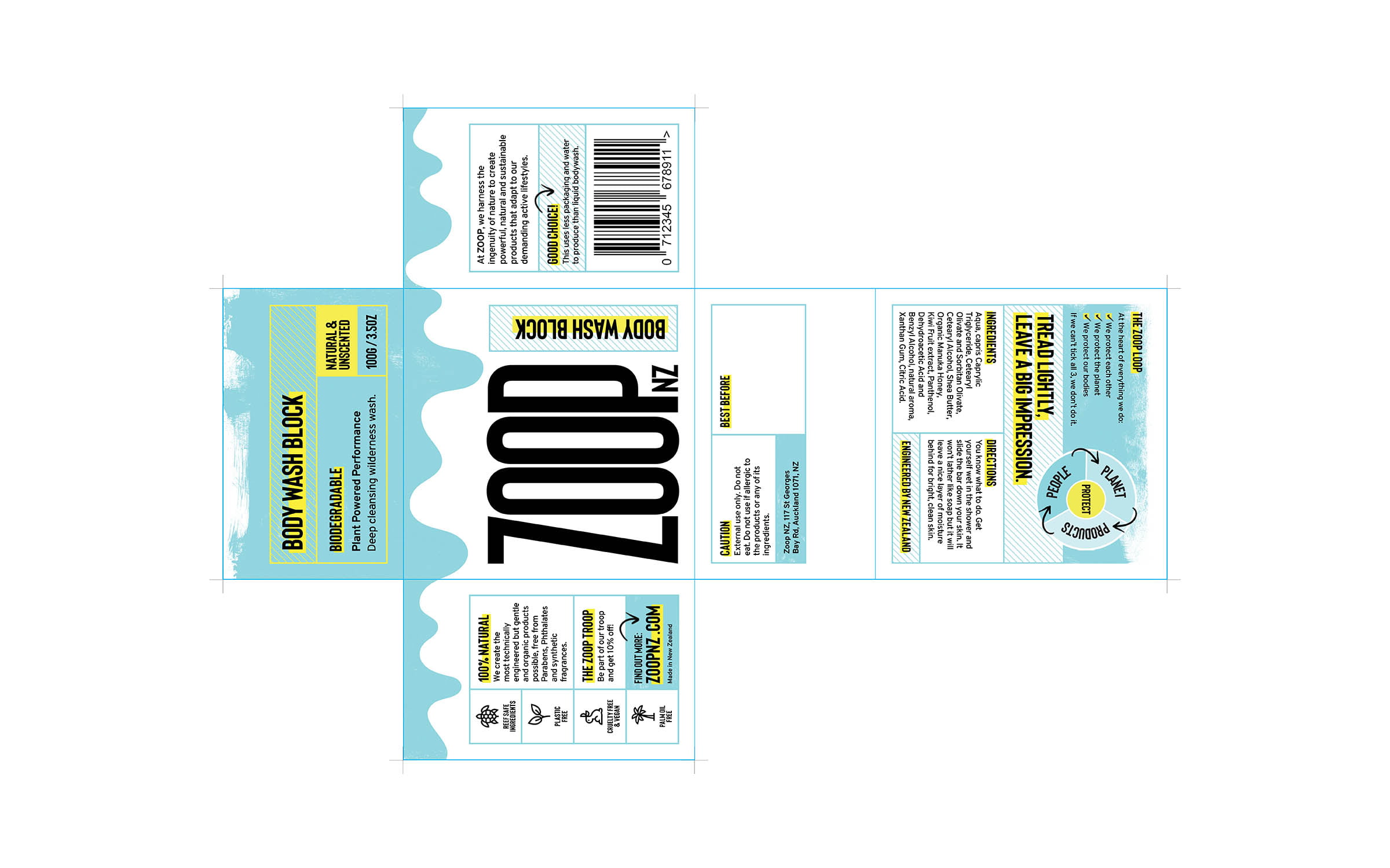
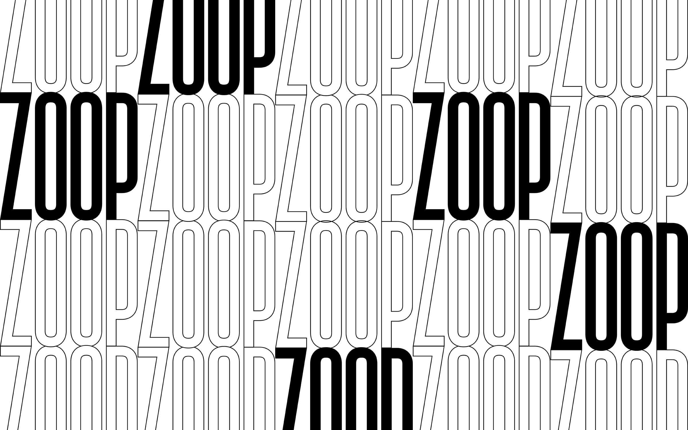
With product packaging the main focus, the brand’s logomark is bold and commanding, designed to make a statement and stand out on the shelf. A balance of elongated hard lines and smooth curves nicely reflects the onomatopoeic nature of the word ‘Zoop’ and make it a perfect fit for giving the brand a brave presence in the bodycare marketplace.
The packaging range is bright, bold and playful featuring the brand’s distinct landscape line. This distinguishable mark has a dual meaning. Not only is it a depiction of the hills, mountains and fjords of New Zealand, it is also representative of the drips of liquid and creams from the brand’s bodycare range. The lines and containers speak to the product’s technical performance while the painted texture and handdrawn marker elements add to the brand’s authentic energy.
What we did
Concepts and idea generation
Brand identity
Packaging design
Printed collateral
Art direction